How to get my company name seen
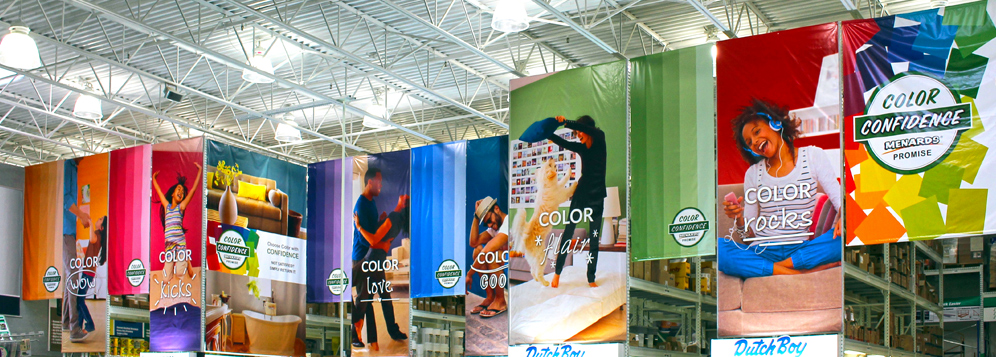
When putting your name on a banner or sign, pay close attention to who you want to see it and where they will see it from. In other words, be sure that your graphic will be legible from the distance most people will be when viewing. (graph below) Beyond the size of the graphic, keep your message short and concise. An effective banner or sign should be easily understood with as little as a glance. Also, be sure to include a contact method so that if your banner or sign is effective enough to get a second glance – there is a way to connect shown in the form of a phone number or website address. The old rule applies perfectly for banners and signs: keep it simple.
Which kind of banner should I use?
Examine where you plan to place a banner to make a better decision for banner type. For banners to be displayed indoors and secured using all corners; use standard banner vinyl. Banners that are meant to be hung like a pennant should be printed on anti-curl vinyl. When placing banners outdoors, use a mesh vinyl to allow for wind flow and lessen the stress where the banner is secured. Standard and anti-curl may also be used outdoors, but wind slits may be necessary to endure the elements.
Vizcom can help. Contact and meet with one of our experienced account executives and they will be able to advise you on trends, layouts, graphic arrangements, and the best options for your budget. It’s easy, just fill out the “How can we help?” fields on this page and submit, and we will get back in touch.
